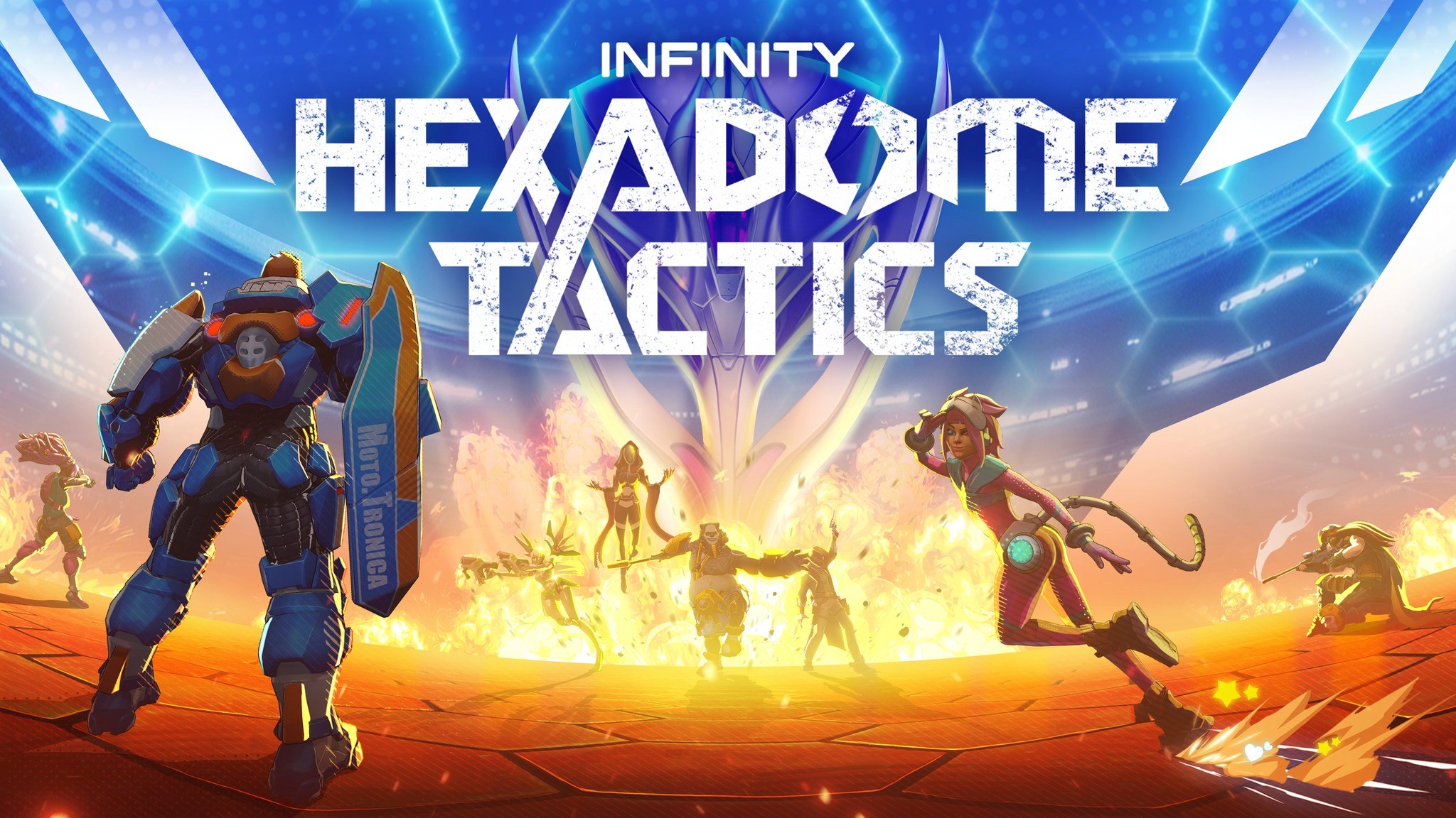
About
Hexadome Tactics is a 1v1 turn-based team tactics game based on Corvus Belli's board game Aristeia, scheduled for release in 2025.
⚠️ The game is still in development, so the Design is not final ⚠️
My Responsibilities
As the Senior UX/UI Designer on a part-time contract with Blindspot Games, I joined the project in its late development stage and provided strategic guidance and actionable suggestions to improve the user experience. I conceptualize in-game navigation and menu flows, optimizing them for both PC and gamepad inputs to enhance the overall gameplay experience across multiple platforms.
Improvements I contributed to:
Redesign of the main screen and navigation
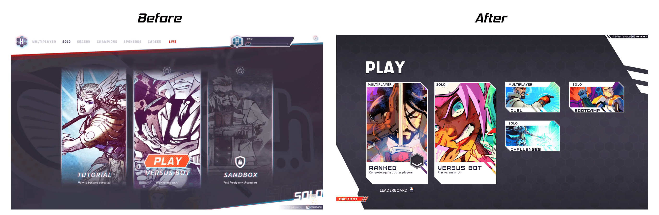
Redesign of the game mode selection
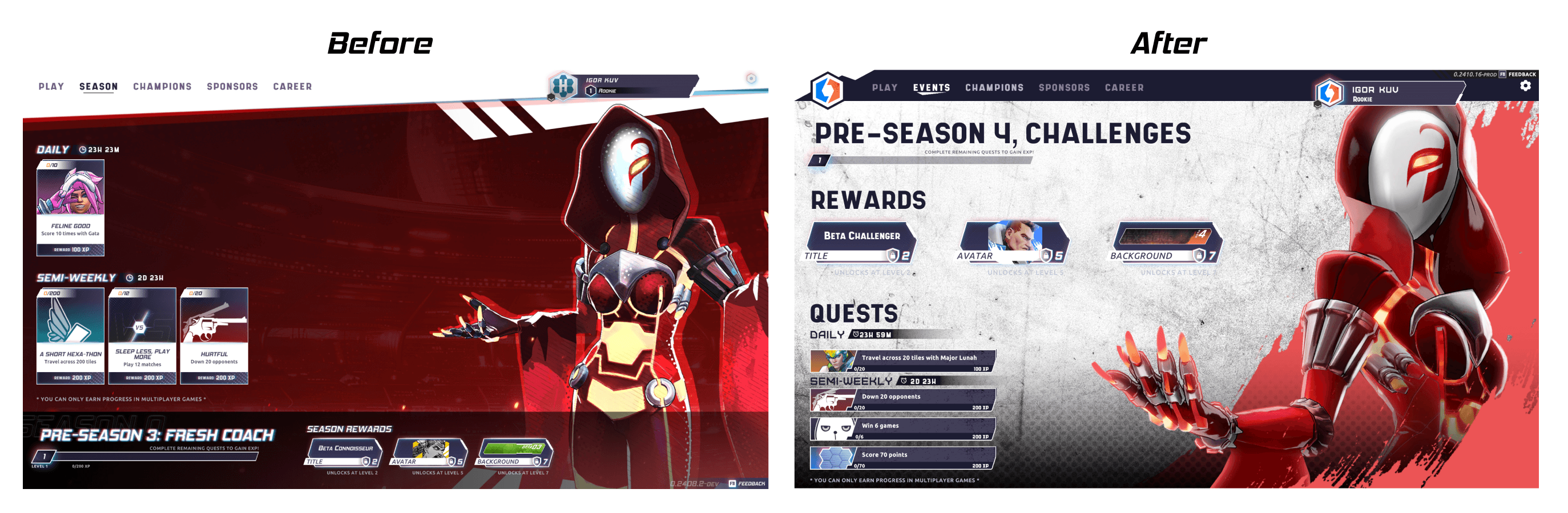
Redesign of the Season screen
HUD color scheme and contrast
Features I worked on:
Champion selection flow
Upgrade improvements
Tooltip improvements
Research & Evaluation
I started by analyzing the game from a player’s perspective to identify key friction points during navigation and overall gameplay. One of the game's core requirements was support for gamepad controls, so I validated the current navigation system accordingly.
To better understand the player experience, I watched streams and gameplay videos, and read feedback on Discord. Additionally, I interviewed game designers and stakeholders to gain insight into the product goals and requirements.
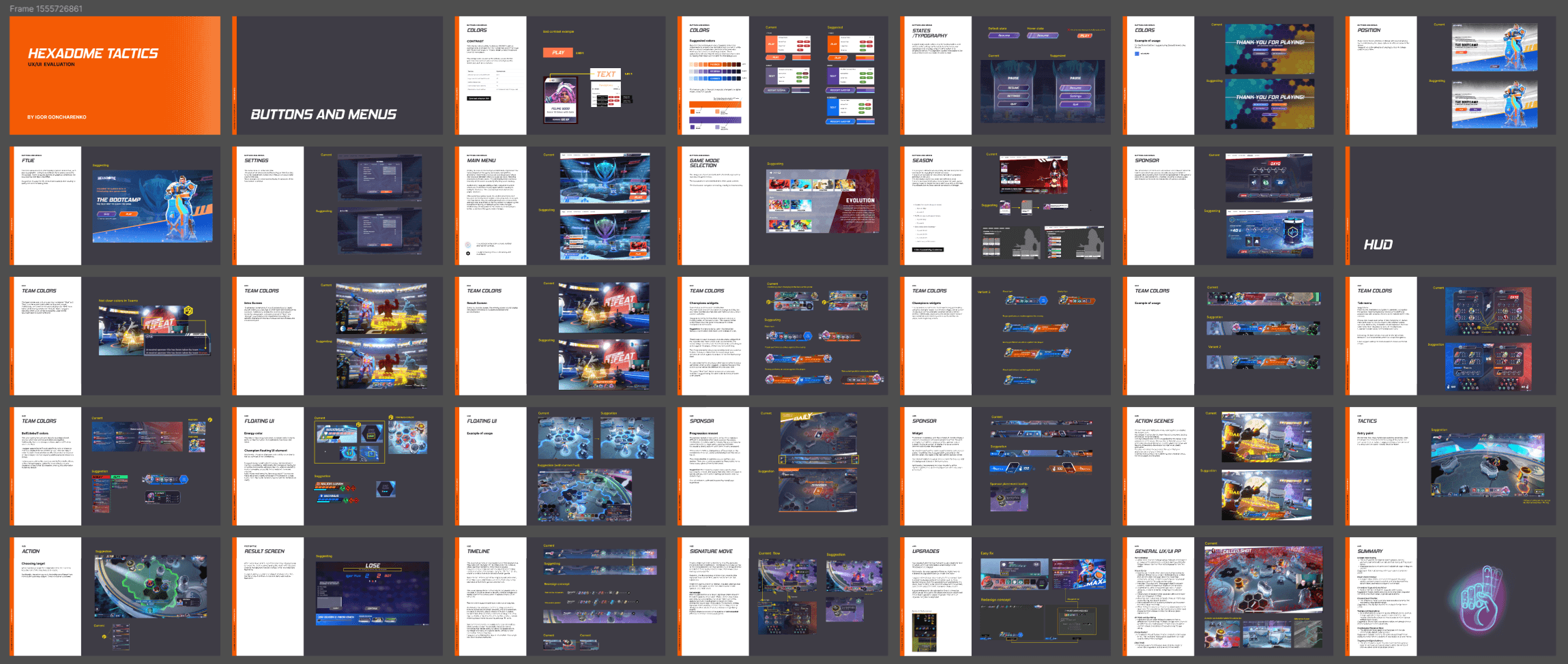
As a result, I compiled a presentation with a list of suggestions and quick improvements that can be implemented and tested in upcoming public tests.
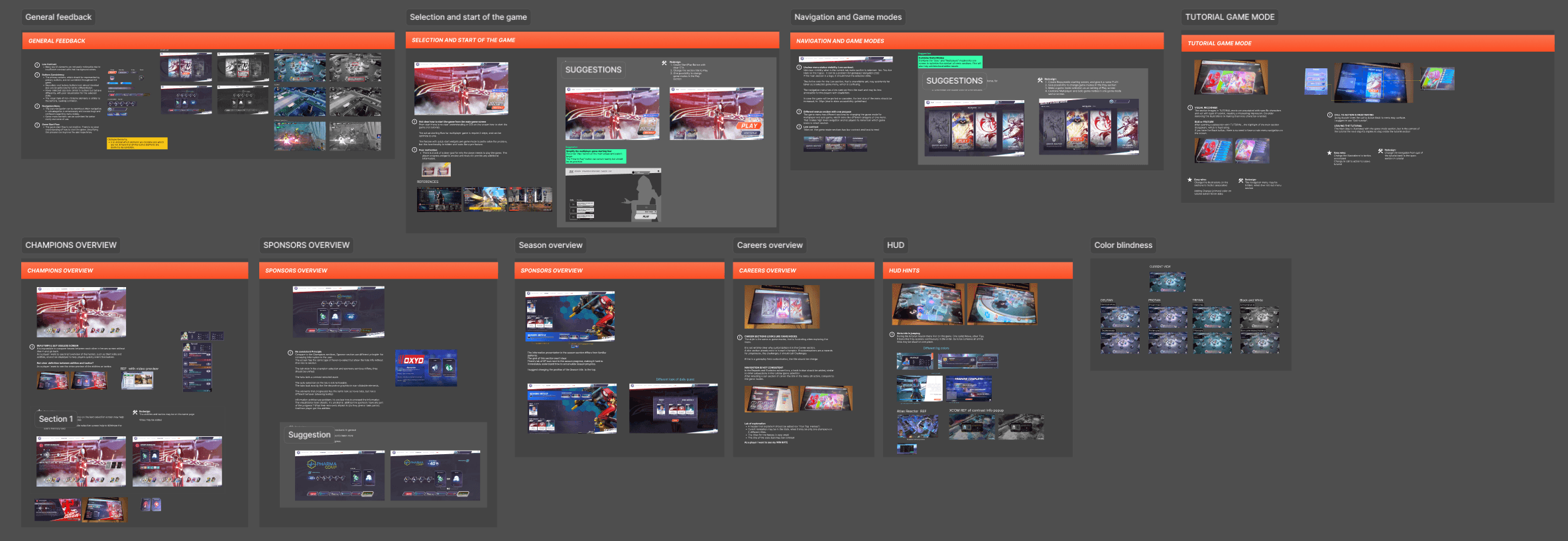
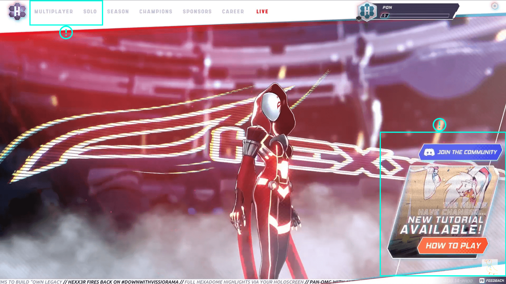
Evaluation of the menu navigation
Evaluation of the game hud
Defining the Problems
During the UX/UI evaluation, I identified many pain points and areas for improvement and also emphasized the core issues that were crucial to focus on.
1. Navigation
I found that the existing navigation panel was not well-suited to modern gamepad usage patterns, and having the gamepad support requirements I pointed it out as the number one priority.
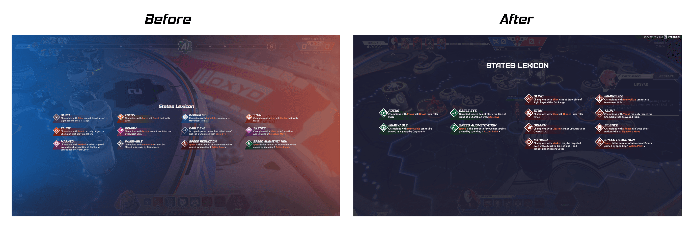
Contrast
Another significant issue was the lack of contrast in many elements, including primary buttons and actions. The overall color palette seemed unfinished and didn’t support the competitive tone of the game.
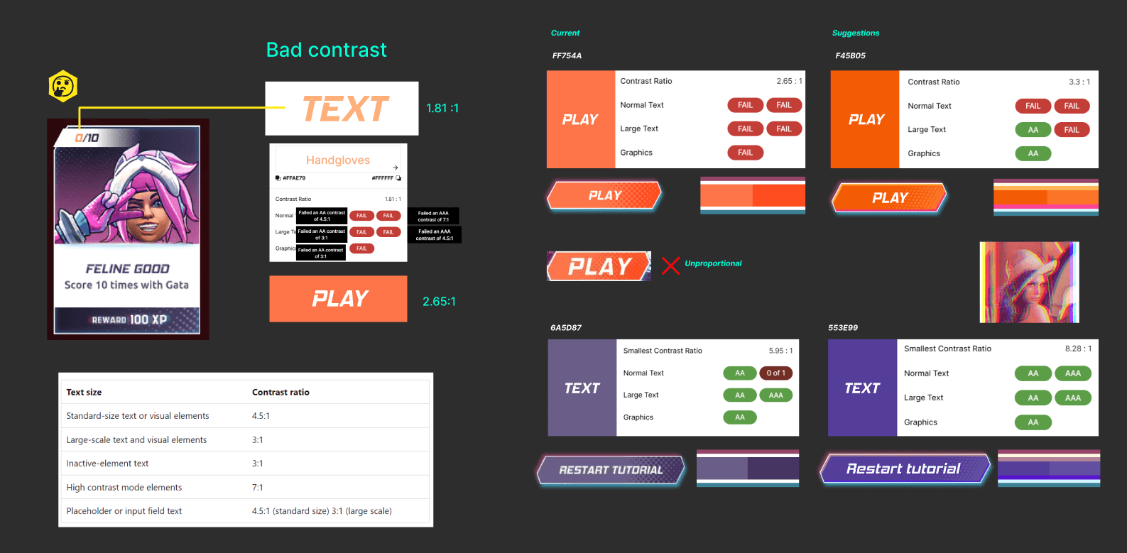
Pointing out low-contrast
Color coding
I also emphasized that the variety of colors in the HUD competed with each other during gameplay, leading to readability issues and confusion around certain mechanics. This brought up a discussion about how the wide range of colors in the UI made the visual identity appear more casual, despite the game targeting mid-core to hardcore strategy players.
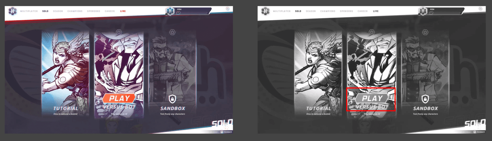
Screenshots of the hud
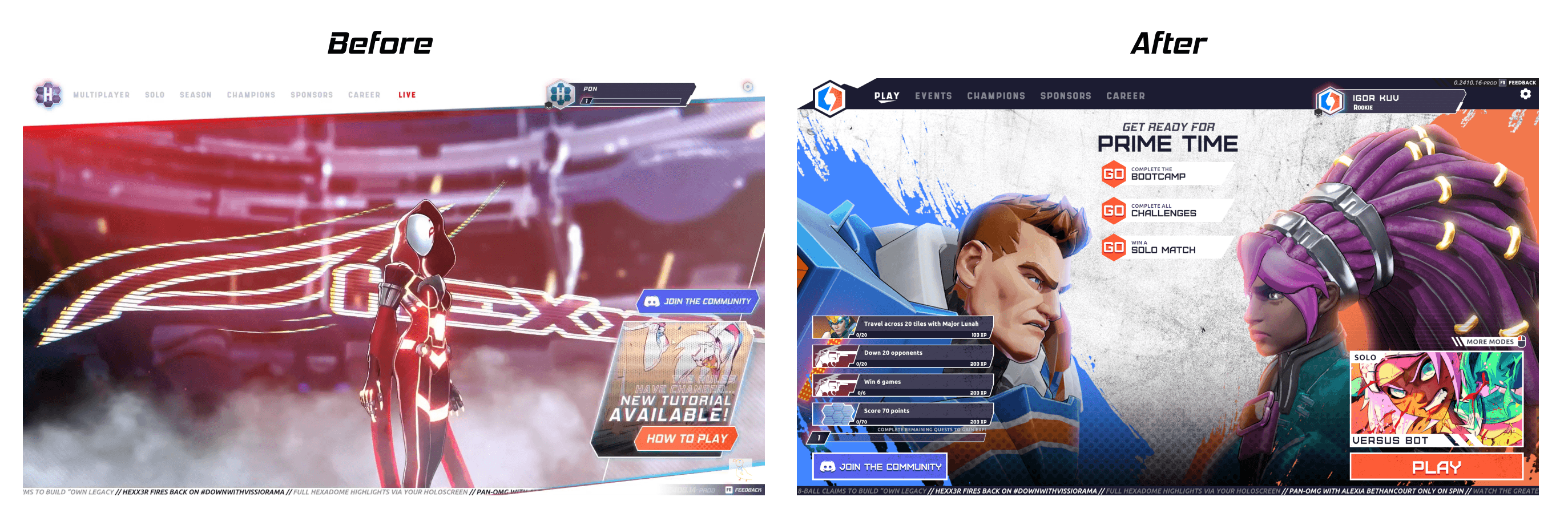
Solution
Based on player use cases, I proposed a list of improvements that incorporated best practices and core principles of cross-platform game navigation. These improvements included reorganizing the navigation in the main game menu and removing unnecessary navigation subcategories. I also introduced a more prominent call to action on the home screen and redesigned the game mode selection entry point.
Navigation
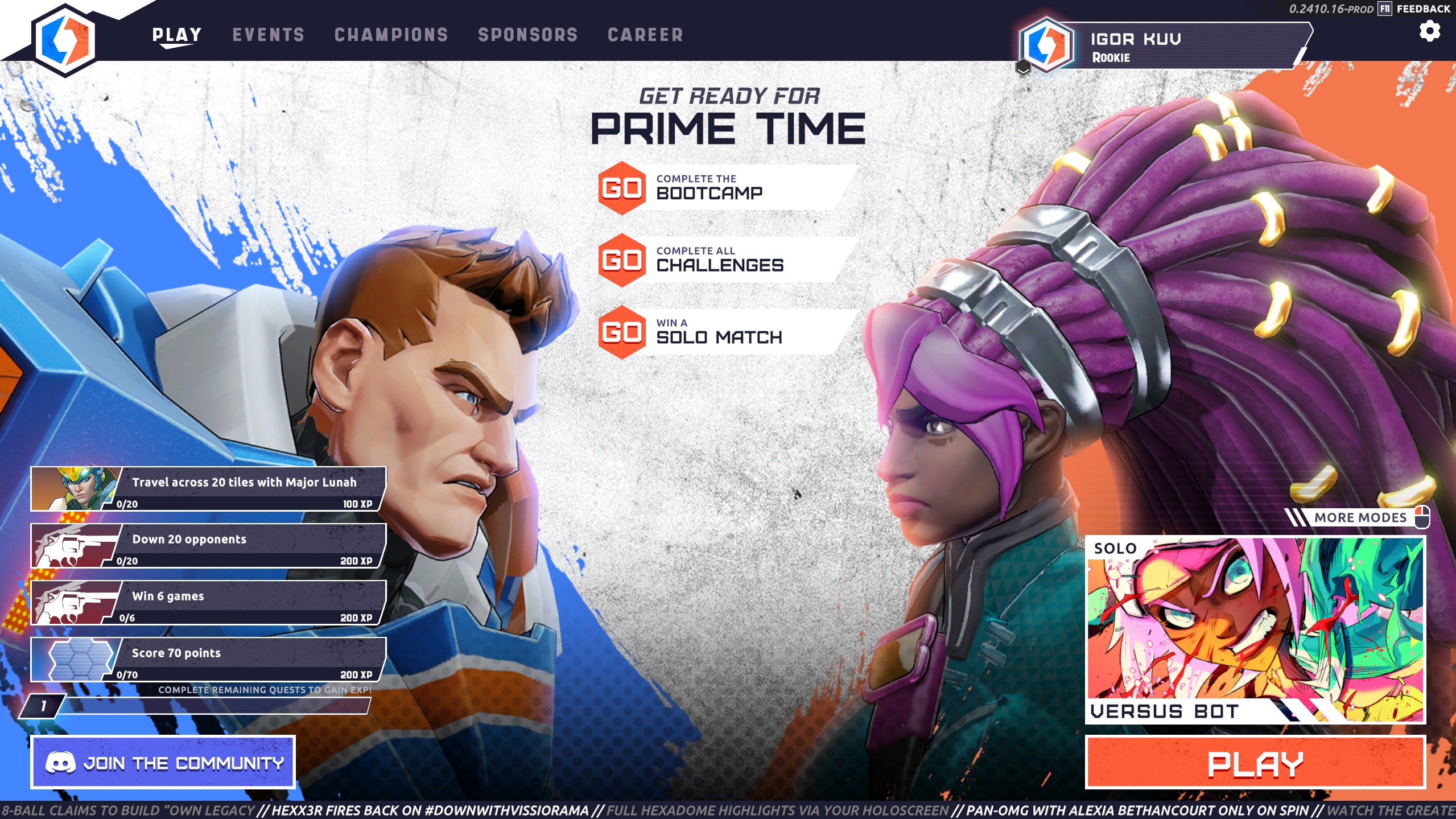
Home screen Beta
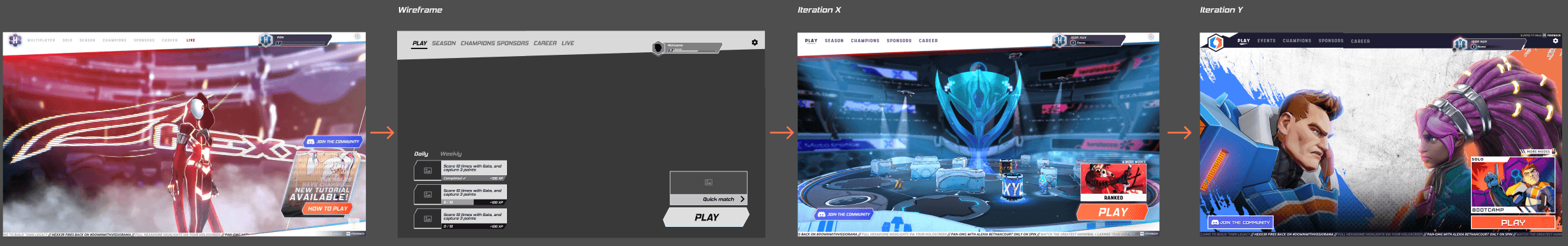
Wireframe and Iterations
Through several iterations, the team implemented the new menu navigation, revised the game’s color scheme, created a focused competitive team-vs-team visual style, and improved visual clarity and contrast.
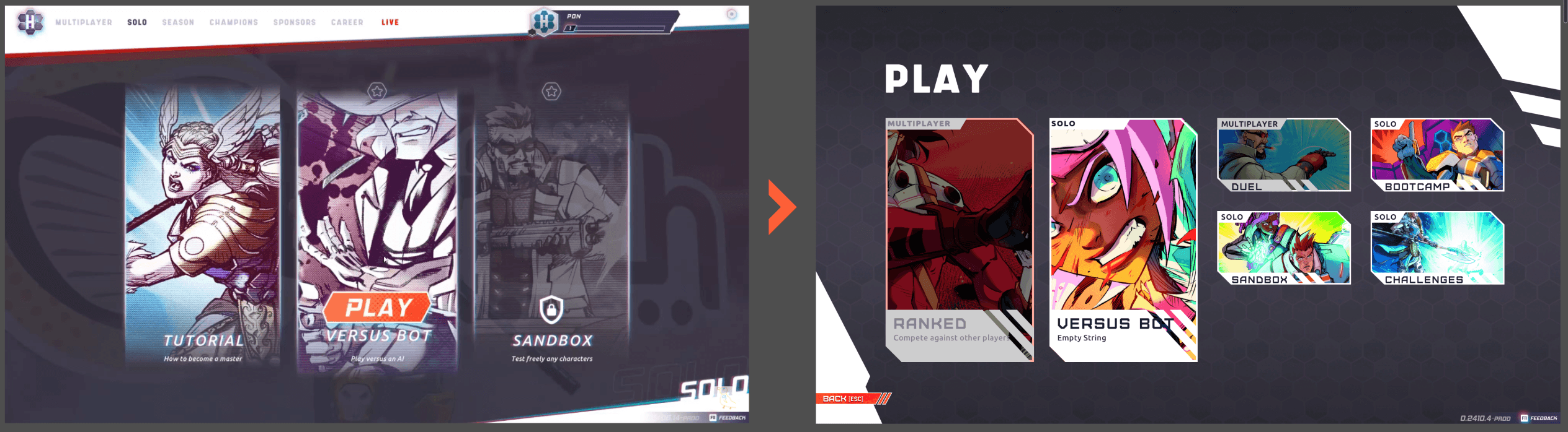
Gamemodes selection iteration
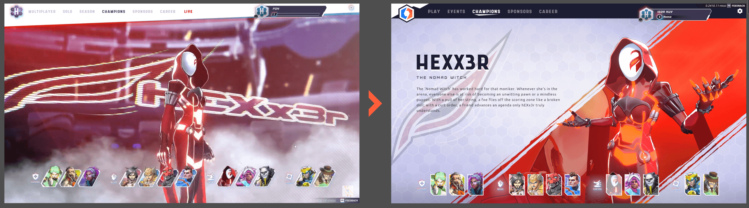
Champions preview iteration
Color Contrast and Color Optimization
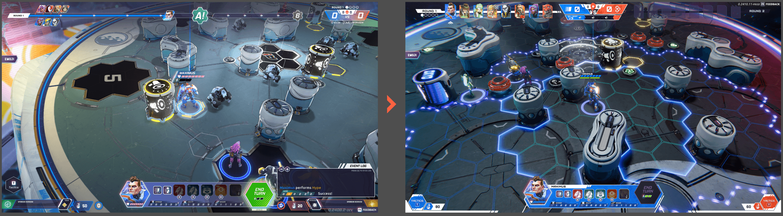
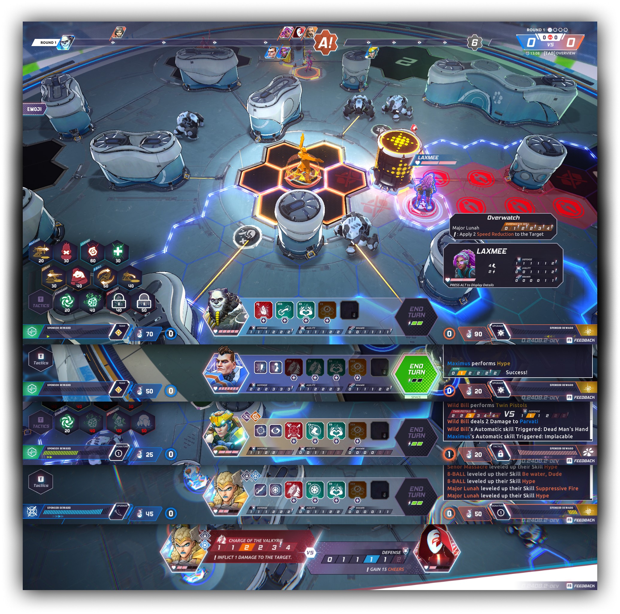
Hud iteration
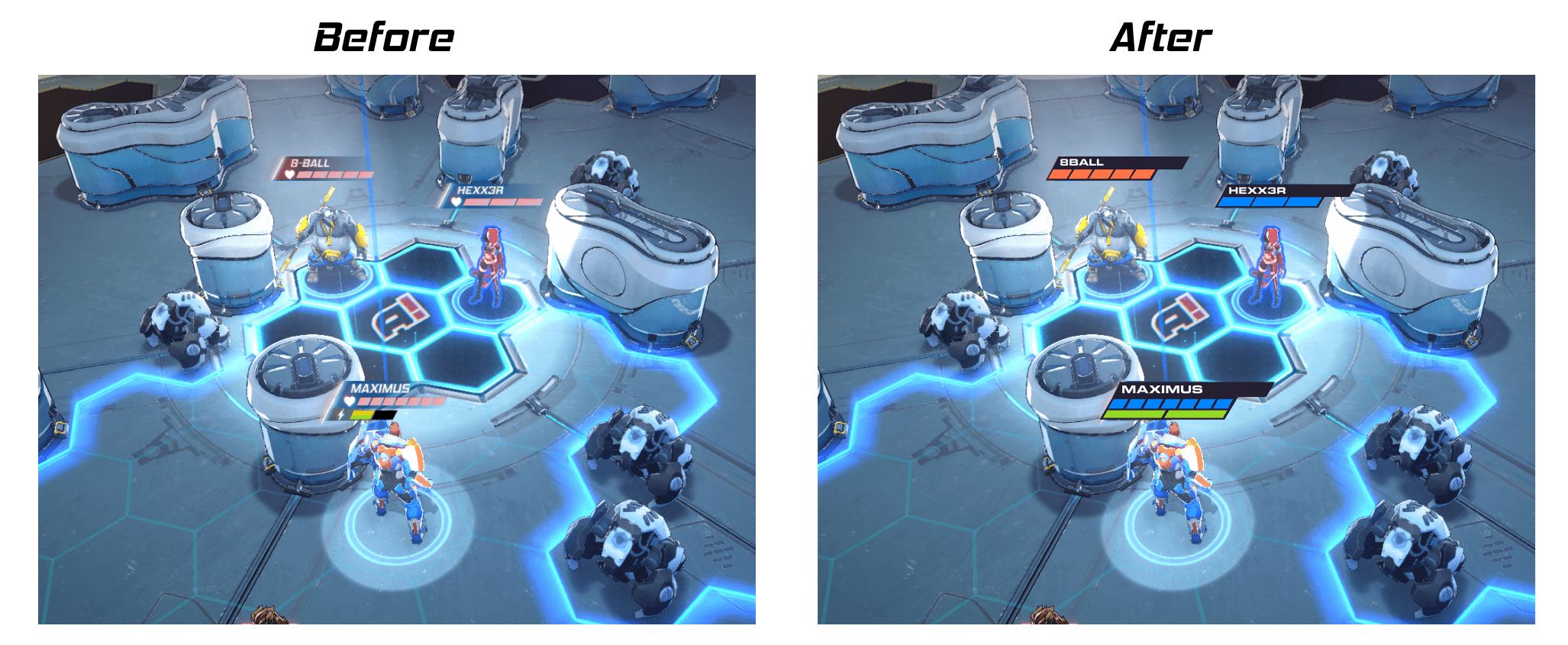
HP bars iteration
Buffs / Debuffs iteration
Champion selection Flow. [Feature]
One of my tasks is to validate the concept of the champion selection flow. After receiving the storyboard concepts, I begin by analyzing and conducting research.
The challenge for this feature was effectively communicating a non-obvious selection flow to the player. It starts with a coin toss, followed by the player and opponent picking their team of 4 champions in the order: 1-2-2-1-1. After that, the sponsor selection happens in a 1-1 order. Another requirement was to showcase the champions in glorious 3D.
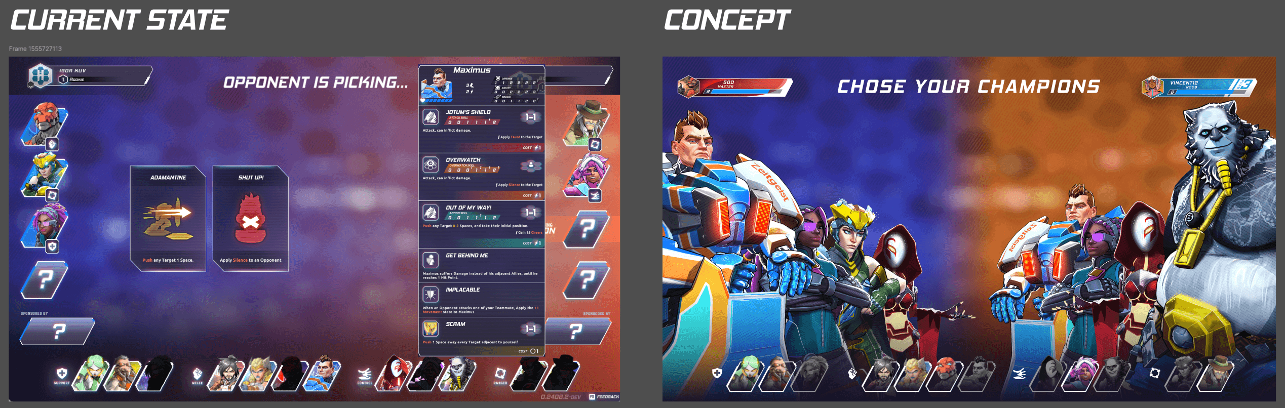
While analyzing the storyboard, I identified key areas for improvement and created a list of use cases.
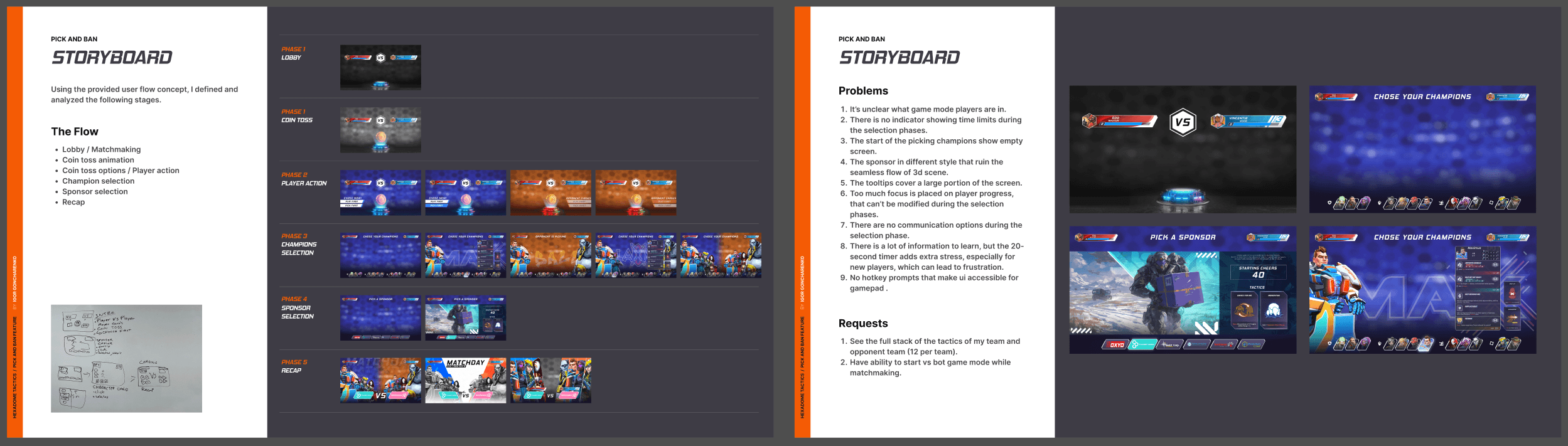
Storyboard analysis slides
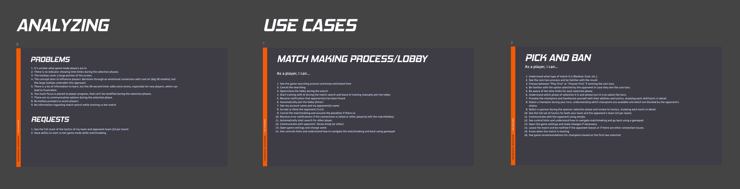
Use cases
I iterated on the provided concepts and created a UX flow for both scenarios. Additionally, I developed an interactive prototype and included a video demonstrating the happy path.
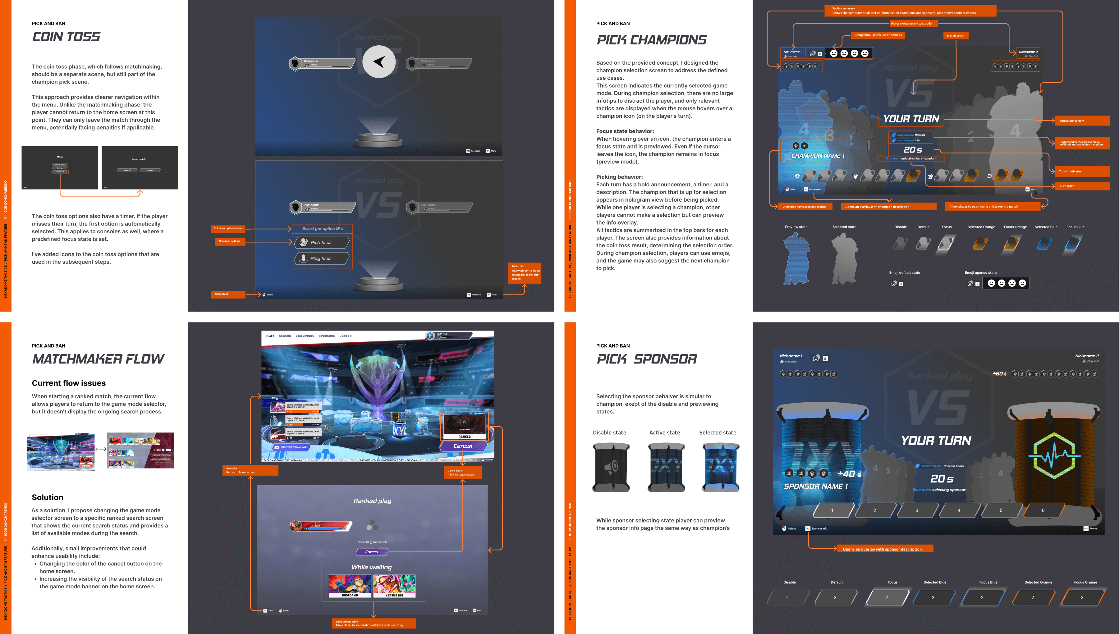
I also provided suggestions for improving matchmaking navigation, allowing the player to start a match against the AI while the matchmaker searches for an opponent.
Champion info screen. [Feature]
While working on the champion selection screen, I came up with the idea to include a champion info screen that displays each champion's abilities. This solution minimizes the amount of information shown at once, while still allowing players to read all the details if they choose.
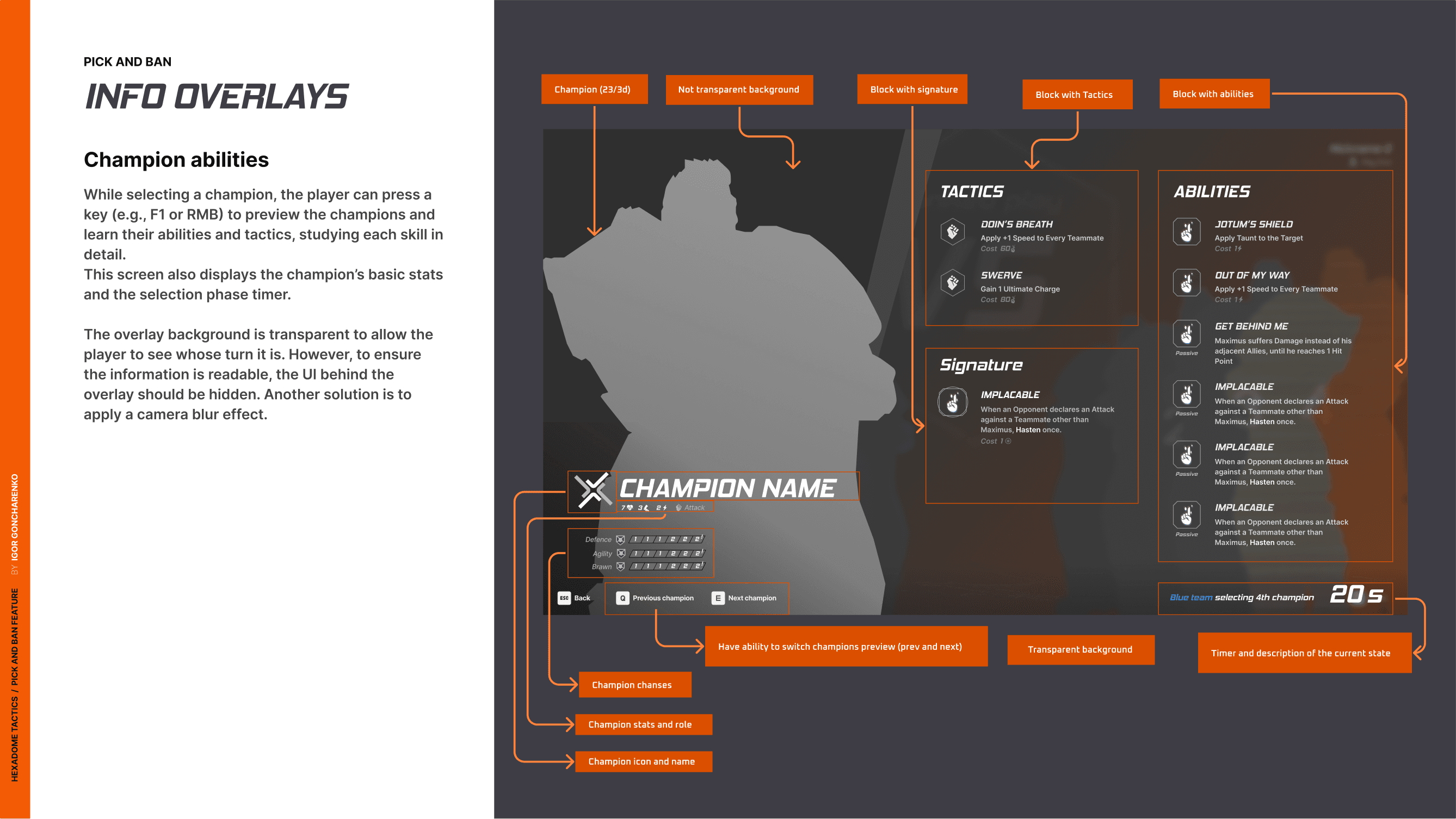
UX layout of Champion info overlay
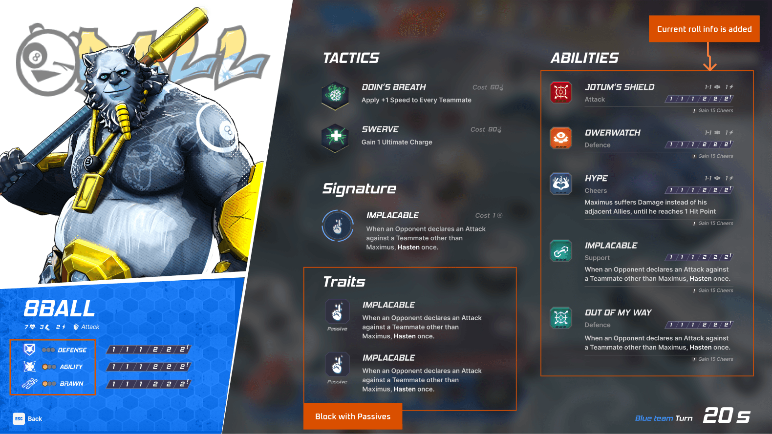
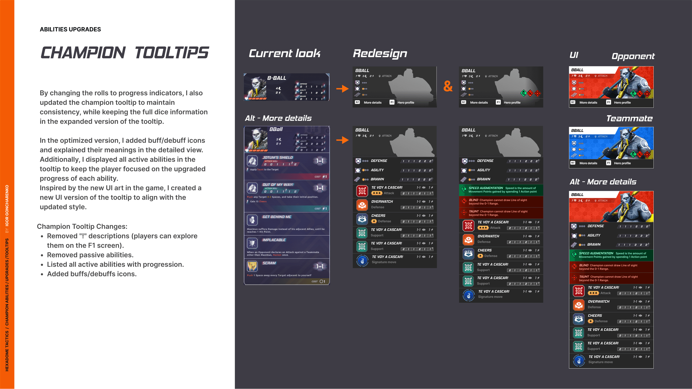
Champion tooltips. [Iteration]
Hexadome features a large variety of content and information, leading to a steep learning curve for players. To help with this, every detail is explained through tooltips. However, some tooltips became too large, taking up too much screen space. One of my tasks was to iterate on the champion tooltips and redesign the entire tooltip structure. My goal was to simplify the information displayed, focusing on the most relevant and contextual details that help players achieve their objectives.
To accomplish this, I created a list of use cases, discussed them with the design team, and iterated on the layout. The main idea was to focus players on champion progression and clearly explain buffs and debuffs. For more detailed information, I added a hotkey that allows players to open the Champion Info screen. For this, I proposed reusing the screen from the champion selection flow.
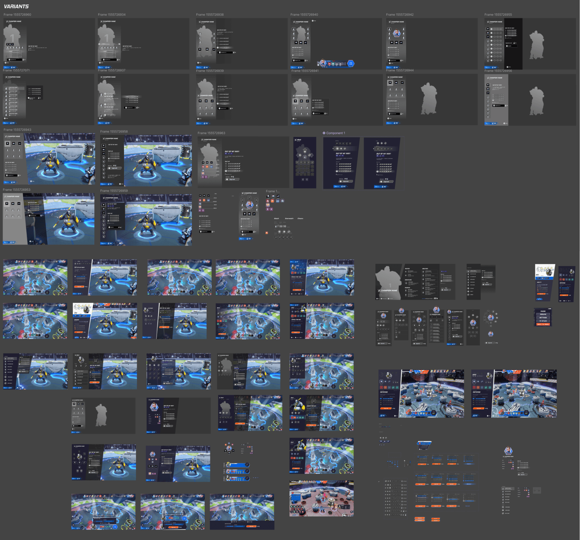
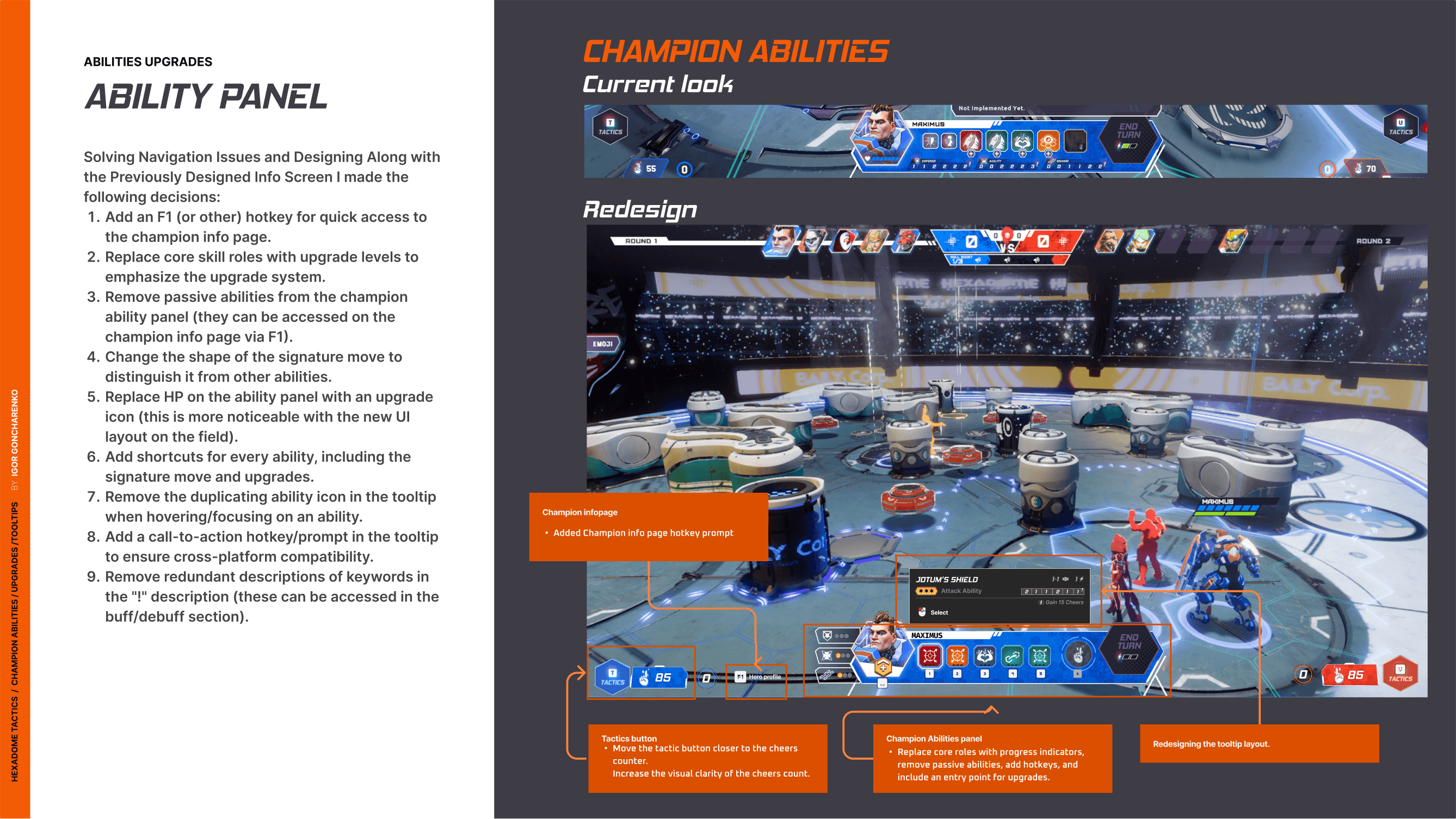
Abilities upgrade. [Feature]
Another feature I worked on was the champion abilities upgrade system. The challenge was designing navigation that works seamlessly for both mouse and gamepad inputs while reducing cognitive overload from the amount of information without limiting access to it.
I started with research and analysis and then created a list of use cases.
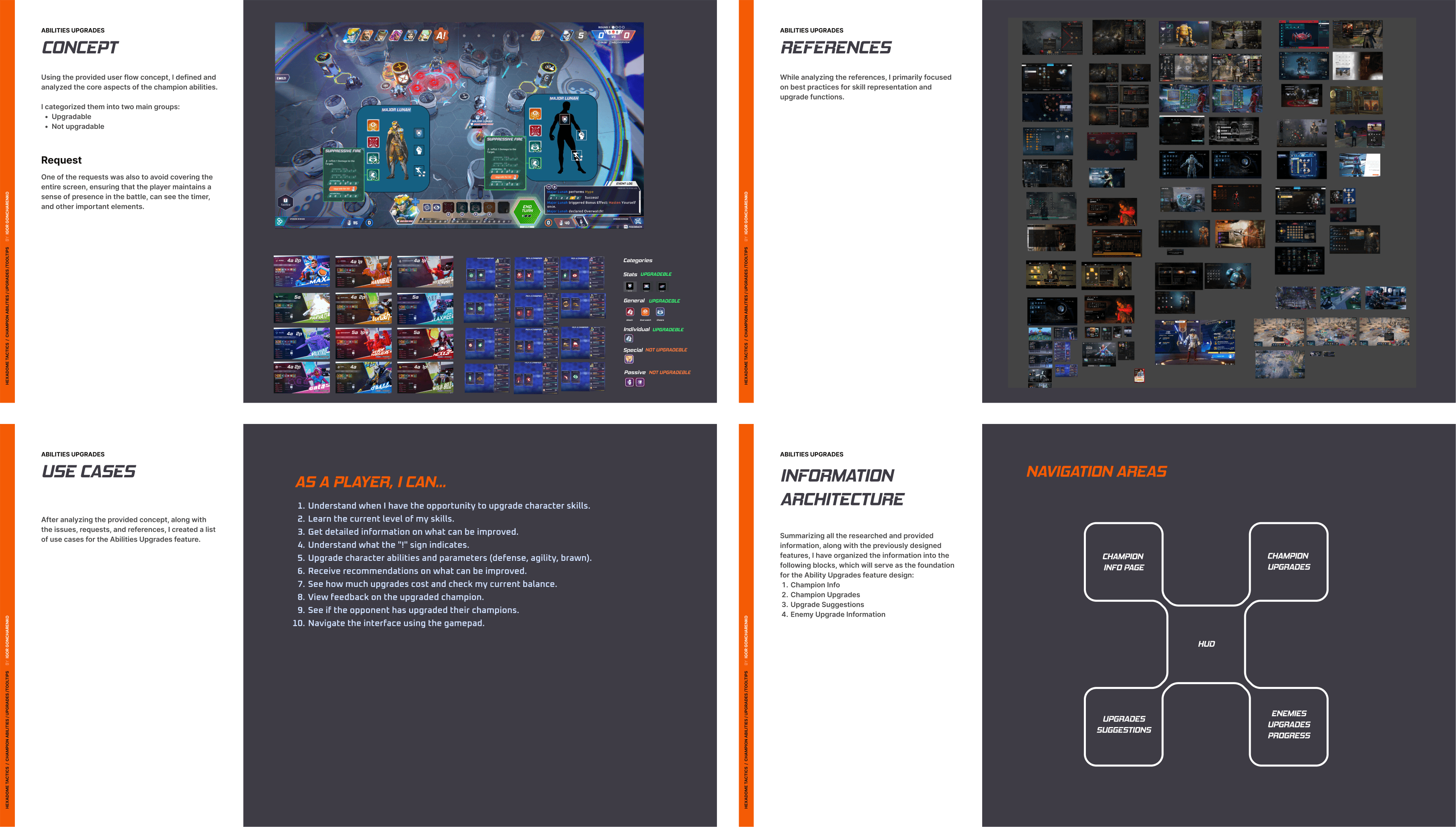
Then I start to design concepts.
Following validation with the design team, I received a requirement to avoid covering a large portion of the screen. I continued to iterate on the concepts with this requirement in mind.
Solution 1. Situative improvements
While redesigning the ability tooltip, I found a solution that addresses the following use cases:
"Get all the information about what can be improved"
"Get recommendations on what can be improved."
The main idea is to display the ability tooltip with roll upgrades at the stages when the player has already selected the ability and is previewing the roles between their action and the opponent's response.
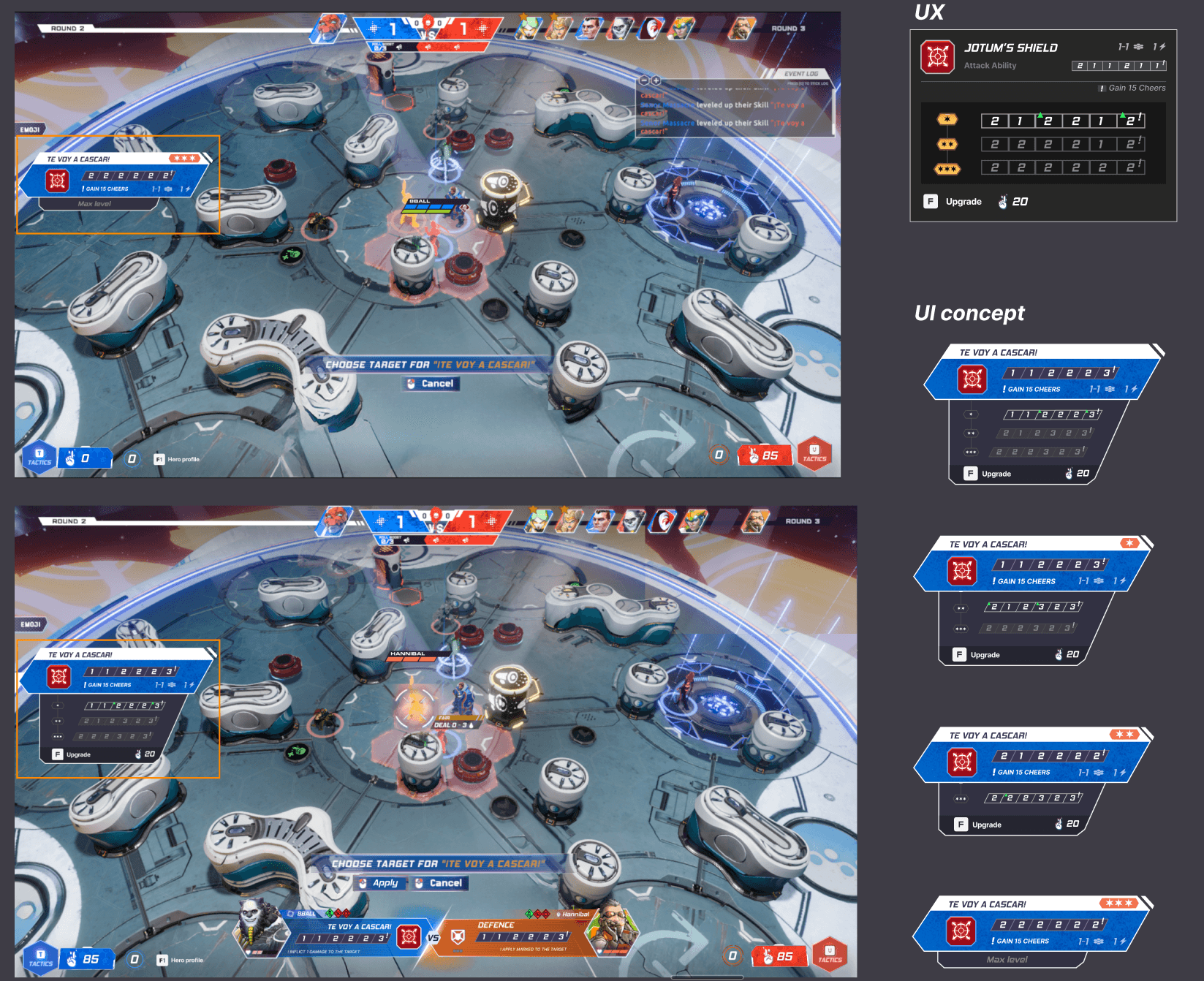
While iterating on the Champion upgrades, I also addressed the issues I had previously identified. The main issue was that the abilities dock was not optimized for gamepad use. I iterated on it and designed a more user-friendly concept. Additionally, I proposed replacing actual rolls with core stat improvements to make them cohesive with the previously designed features.
This allowed me to make well-informed decisions that shaped the second solution I developed.
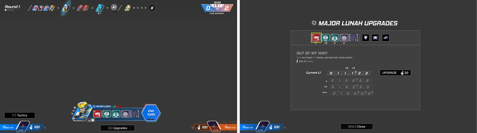
Solution 2. Upgrades Sidebar
This solution provides more user-friendly navigation for both PC and console inputs while ensuring that no more than one-third of the screen is covered. It allows players to explore abilities and core ability dice rolls in advance and upgrade them. Additionally, buff/debuff information is displayed on this screen.
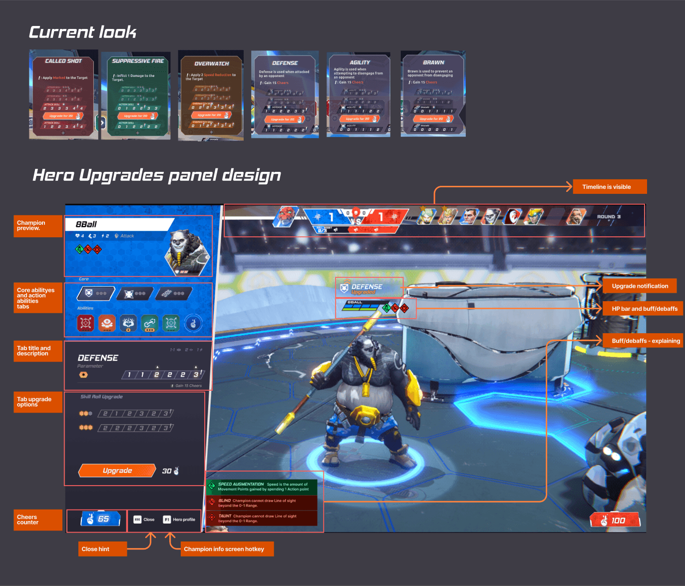
To present this concept, I created an interactive prototype and recorded a video showcasing the flow, demonstrating additional details and ideas.
The game is still in development, so the showcased UX concepts are part of the development process and may change or improve based on feedback from the upcoming playtests.